YOU'LL BE BACK FOR MORE
ABOUT
Roost is a relatively new restaurant in my hometown of Portland, Oregon, and their logo and in-house atmosphere lacked individuality and allure.
I spoke with owner & Head Chef, Megan Henzel about how she would like to see the Roost identity evolve.
Pictured: the existing Roost signage at the restaurant (1403 SE Belmont St, Portland, OR 97214).
THE DIRECTION
Pictured: Inside Roost Restaurant.
After corresponding with the owner, Megan, my objective was to design a mature logo that expressed comfort and coziness; representing a restaurant where 35 and older customers would loosen their ties after work. Making sure the logo was not clichéd was very important.
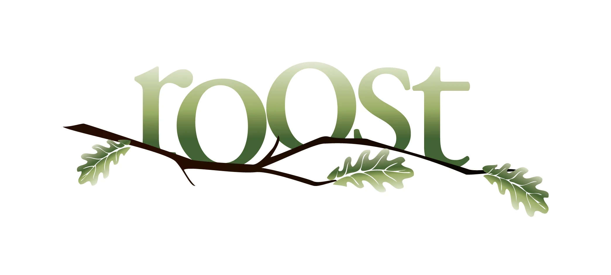
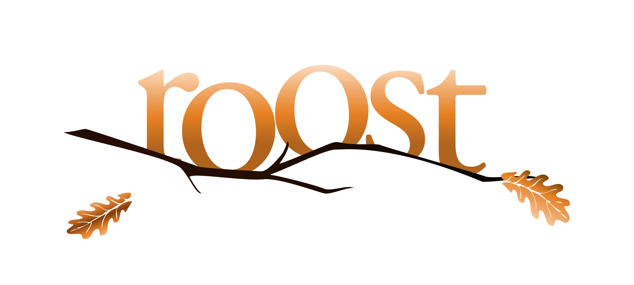
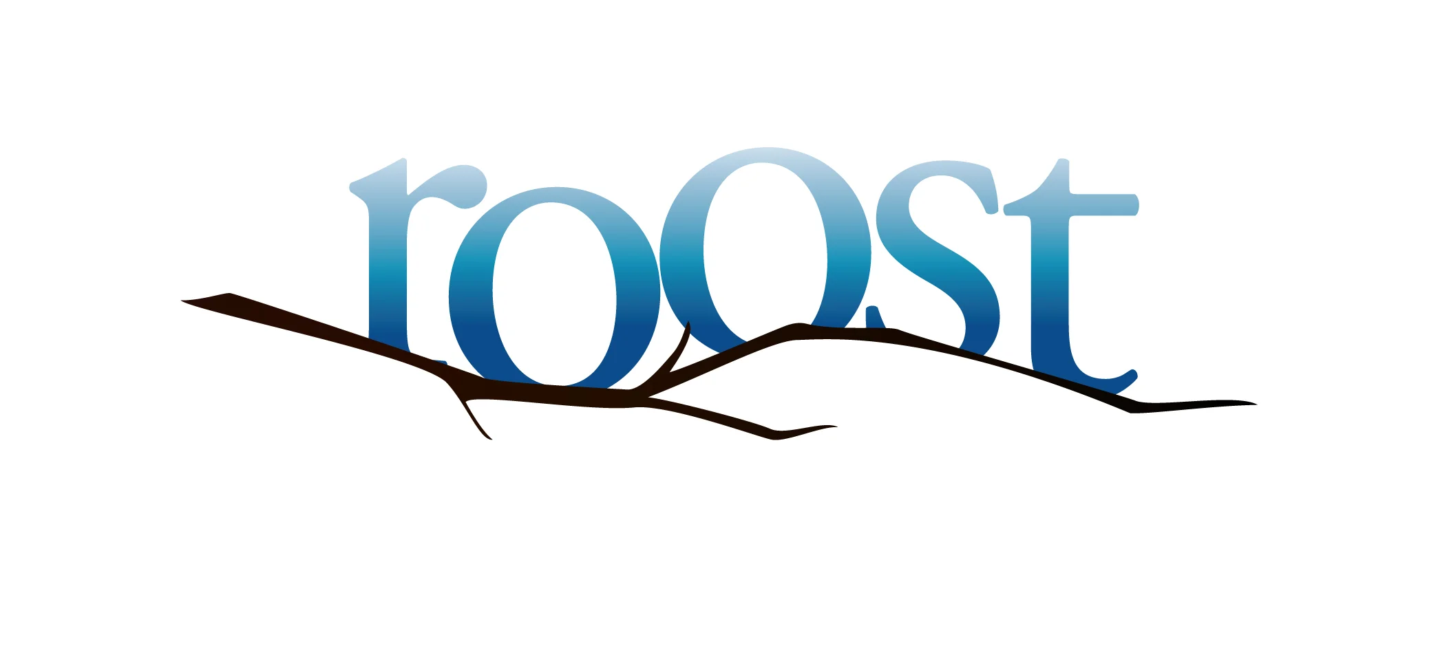
By definition, a roost is a place where birds rest (not necessarily a nest). I incorporated a thin oak branch below the letters as a perch, the angular bends of which match the contours of the hills on the Portland's western border.
“I like Anthropologie’s changing display in front of their stores, it keeps things interesting!”
After discussing the brands that inspire her, the dynamic nature of Anthropologie's storefronts was a major inspiration for the redesign. To apply this concept to the Roost brand, I created 4 different logos of varying color and tree branches to correspond with the four seasons. To match the very distinct seasons in Portland, each variation of the logo feels right at home with the weather it would be displayed during.
Portlanders are very proud of their city. The adapting logo adds value for local customers who will watch it change throughout the year. It also works to establish Roost as a point of interest for visitors who want a taste of the local dining experience.


